
MakingForm
A form designer component that visualizes form pages
Code Demonstration
Basic Usage
<template>
  <fm-making-form
  	ref="makingform"
    style="height: 700px;"
    preview
    generate-code
    generate-json
  >
  </fm-making-form>
</template>
notice
The default height is 100% of the height of the parent element, but if the parent element does not specify a height, the form designer can specify a specific height.
Click to see the effect
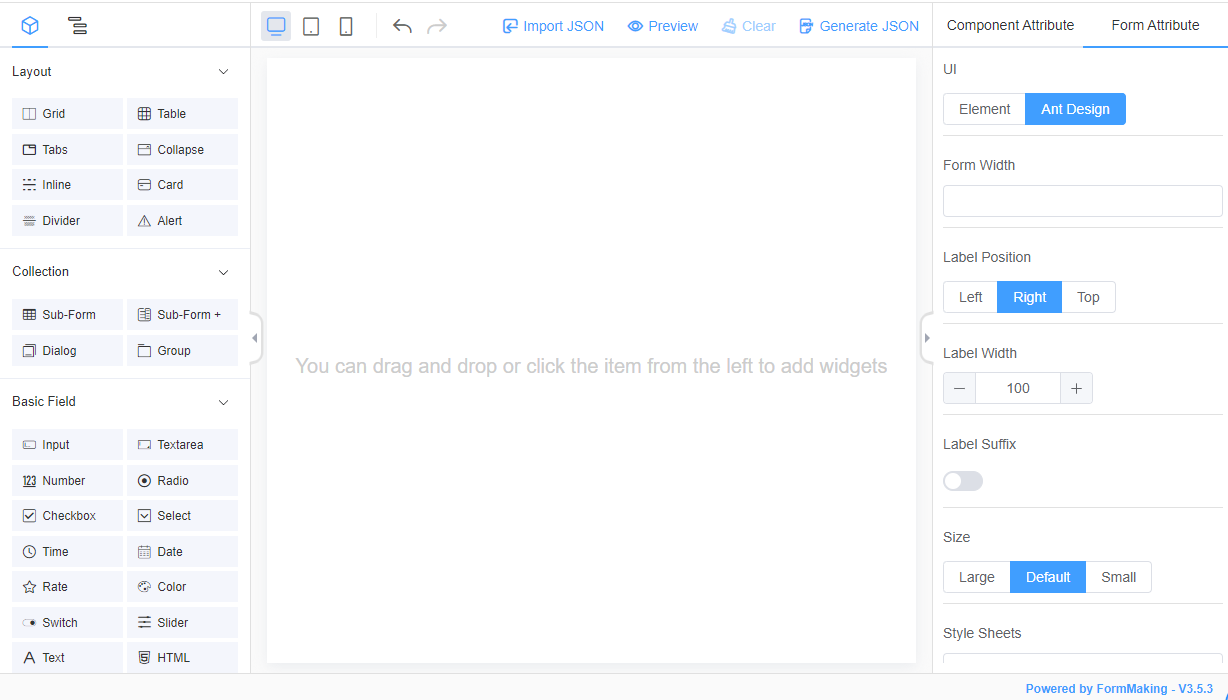
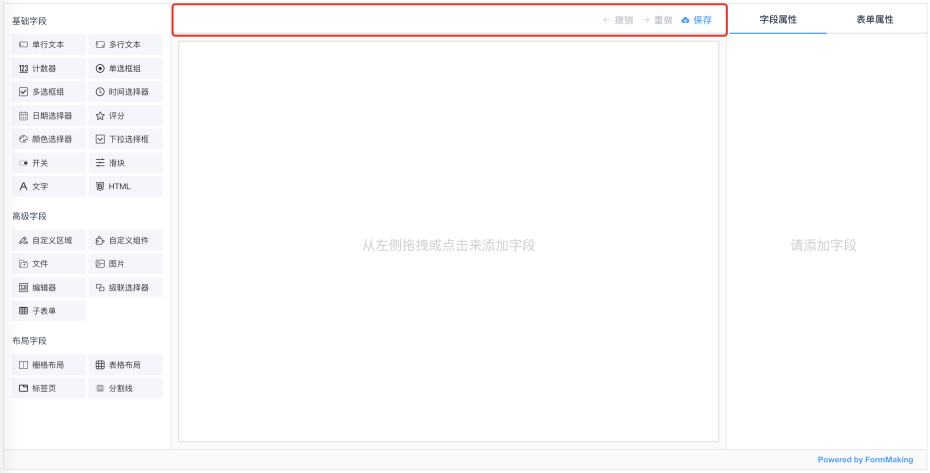
Customize Action Buttons
<template>
  <fm-making-form
    ref="makingform"
    style="height: 700px;"
  >
    <template slot="action">
      <!-- Customize the operation area slot -->
      <el-button type="text" icon="el-icon-upload">Save</el-button>
    </template>
  </fm-making-form>
</template>
Click to see the effect
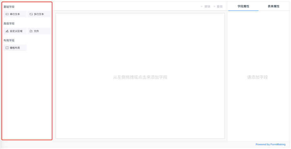
Designer Left Field Configuration
<template>
  <fm-making-form
    ref="makingform"
    style="height: 700px;"
    :basic-fields="['input', 'textarea']"
    :advance-fields="['blank', 'fileupload']"
    :layout-fields="['grid']"
  >
  </fm-making-form>
</template>
Click to see the effect
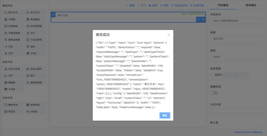
Saving Form JSON
<template>
    <fm-making-form
      ref="makingform"
      style="height: 700px;"
      preview
      generate-code
      generate-json
    >
      <template slot="action">
        <el-button type="text" icon="el-icon-upload" @click="handleSave">Save</el-button>
      </template>
    </fm-making-form>
</template>

<script>
export default {
  methods: {
    handleSave () {
      const json = this.$refs.makingform.getJSON()

      this.$alert(json, 'save successfully!')
    }
  }
}
</script>
Click to see the effect
Importing Form JSON
Import the designed form JSON Schema into the new designer.
<template>
    <fm-making-form
      ref="makingform"
      style="height: 700px;"
      preview
      generate-code
      generate-json
      @ready="handleFormReady"
    >
    </fm-making-form>
</template>

<script>
export default {
  methods: {
    handleFormReady () {
      this.$refs.makingform.setJSON(
        // Form JSON object
      )
    }
  }
}
</script>
notice
We need to import the json after the designer is initialized and do that in the ready event
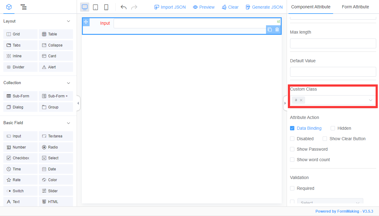
Initialize the Form Stylesheet
<template>
  <fm-making-form ref="makingForm" clearable upload preview generate-code generate-json
    :global-config="globalConfig"
  >
  </fm-making-form>
</template>

<script>
export default {
  data() {
    return {
      globalConfig: {
        // The preset styles of the form can be put into the designer
        styleSheets: '.a .el-form-item__label{color: red;}'
      }
    }
  }
}
</script>
notice
The designer will automatically parse the configured stylesheet when it is initialized, extract the first-class Class name, and configure it in a Custom Class.
Click to see the effect
Initialize the Form Data Source
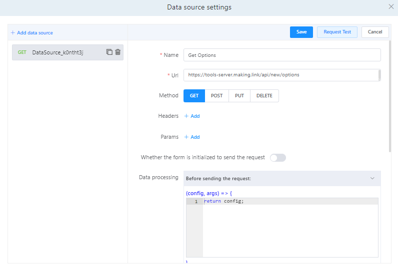
Form data sources can be predefined as follows:
<template>
  <fm-making-form ref="makingForm" clearable upload preview generate-code generate-json
    :global-config="globalConfig"
  >
  </fm-making-form>
</template>

<script>
export default {
  data() {
    return {
      globalConfig: {
        dataSource: [
          {
            key: 'getoptions', // Unique value specified
            name: 'Get Options', // Data source name, unique value
            url: 'http://tools-server.making.link/api/new/options', // Request interface address
            method: 'GET',
            auto: true, // Whether to send a request on form initialization
            responseFunc: 'return res.data', // Data manipulation function contents
            headers: {}, // Data request header, optional
            params: {}, // Data request parameter, optional, (query parameter)
          }
        ]
      }
    }
  }
}
</script>
Click to see the effect
Form Field Default Configuration
The default properties of the fields in the designer can be configured via field-config.
<template>
  <fm-making-form ref="makingForm" clearable upload preview generate-code generate-json
    :field-config="fieldConfig"
  >
  </fm-making-form>
</template>

<script>
export default {
  data() {
    return {
      fieldConfig: [
        {
          type: 'fileupload',
          options: {
            // Configure the upload component address
            domain: 'http://tcdn.form.making.link/',
            action: 'http://tools-server.making.link/api/transfer',
          }
        },
        {
          type: 'select',
          options: {
            // Configure static option data for the drop-down box component
            options: [
              {value: '1111'},
              {value: '2222'},
              {value: '3333'}
            ]
          }
        }
      ]
    }
  }
}
</script>
For more field configurable property, you can refer toField Configurable Property.
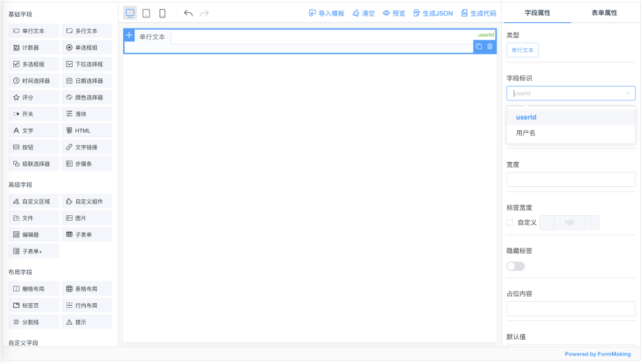
Field identity drop-down select binding
Sometimes when we design a form, the data field identity is already specified, which can be passed to the designer via field-models, and the field binding can be selected at design time.
<template>
  <fm-making-form
    ref="makingForm"
    :field-models="fieldModels"
  >
  </fm-making-form>
</template>

<script>
export default {
  data() {
    return {
      fieldModels: [{
        fieldId: 'userId'
      },
      {
        fieldId: 'userName',
        fieldLabel: 'User Name'
      }]
    }
  },
}
</script>
Click to see the effect
Field property Custom Extensions
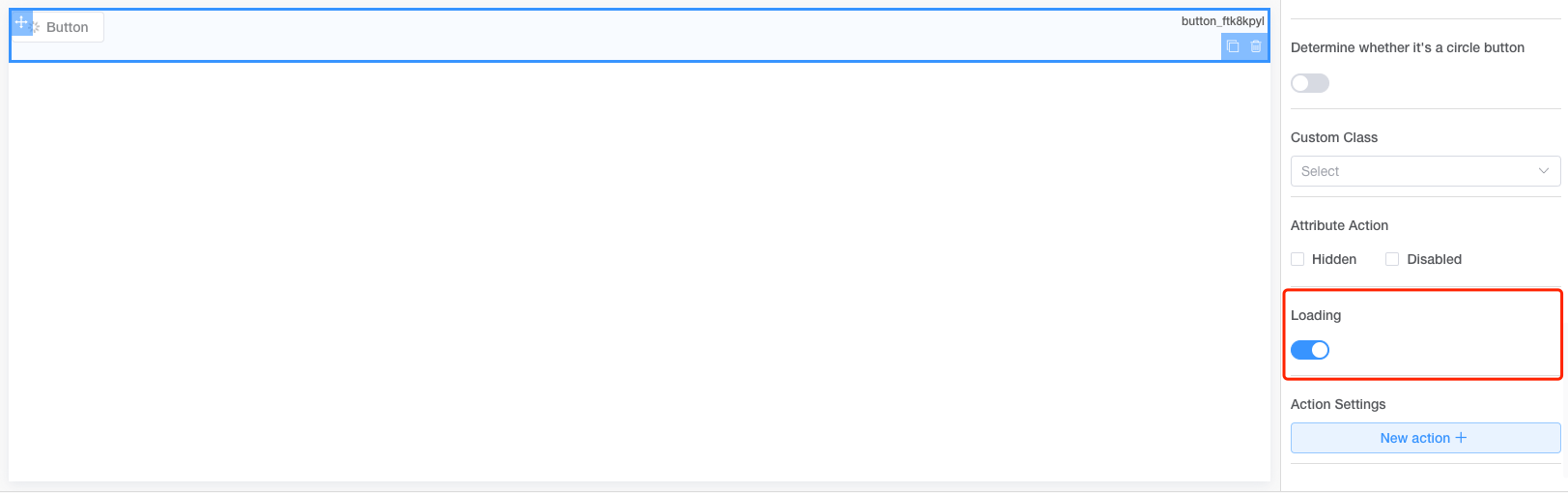
In the field property configuration, we can introduce our own extended configuration through the slot.
<fm-making-form>
  <template #widgetConfig="{type, data, customProps}">
    <el-form-item v-if="type === 'button'" label="Loading">
      <el-switch v-model="customProps.loading"></el-switch>
    </el-form-item>
  </template>
</fm-making-form>
Here we are able to configure the properties of the field via the widgetConfig slot and receive the type:(field type) data:(field json data) customProps:(field custom extended properties for binding configuration items) parameter.
Click to see the effect
API
Property
| Property | Description | Type | Default | Version |
|---|---|---|---|---|
| preview | Preview operation | boolean | false | |
| generate-json | Generate json operation | boolean | false | |
| generate-code | Generate code operation | boolean | false | |
| clearable | Clear operation | boolean | false | |
| upload | Import json operation | boolean | false | |
| basic-fields | Basic field configuration, refer to Field Description-Basic Field | array | - | |
| advance-fields | Advanced field configuration, refer to Field Description-Advanced Field | array | - | |
| layout-fields | Layout field configuration, refer to Field Description-Layout Field | array | - | |
| collection-fields | Collection field configuration, refer to Field Description-Collection Field | array | - | 1.5.0 |
| custom-fields | Custom field configuration | array | - | |
| global-config | The form initializes global configuration, refer to Global Config Options | object | - | 1.3.0 |
| field-config | For more field configurable property, you can refer to Field Configurable Property | array | - | 1.3.6 |
| name | 设计器名称 | 1.4.0 | ||
| cache | You can configure the name property to differentiate whether json is cached to the browser | boolean | false | 1.4.0 |
| json-templates | Template library configuration; {
title: 'Chinese template name',
enTitle: 'English template name',
json: 'Template json',
url: 'Template preview thumbnail'
} | array | [] | 1.4.0 |
| init-from-template | Whether to enable selection from the template library during initialization | boolean | false | 1.4.0 |
| field-models | Field identity configuration, which provides a drop-down binding for designer field identity. {
fieldId: Bind field identification,
fieldLabel: Name of display
} | array | [] | 1.4.1 |
| panel | Left panel default display type: field : Component Library Panel outline : Outline Panel | string | field | 1.4.5 |
Slot
| name | Description | Version |
|---|---|---|
| action | Designer header action button customization area | |
widgetConfig widgetconfig | Field attributes custom extension area, please refer to Field property Custom Extensions | 1.4.5 1.5.2 |
Method
The MakingForm instance is retrieved and the instance methods are called with this.$refs
| Method Name | Description | Parameter | Version |
|---|---|---|---|
| getJSON | Get the json data for the designer | - | |
| getHtml | Get the code generated by the designer that can be used directly - | - | |
| setJSON | Set the json data for the designer | (value) json data fetched by the designer | |
| clear | Clear | - | |
| handleUndo | Undo | - | |
| handleRedo | Redo | - | |
| setSelect | Set the currently selected component by the designer | (field) Field ID | 1.3.6 |
| getFormModels | Gets a list of form field structures | - | 1.5.3 |
| generatePreviewQrcode | 生成手机预览二维码 | (url) 二维码地址 | 1.5.5 |
Events
| Event Name | Description | Callback parameters | Version |
|---|---|---|---|
| ready | The designer is initialized | - | 1.2.18 |
| preview | 表单预览 | (json) 表单JSON配置 | 1.5.5 |
Global Config Options
| Parameter | Description | Type | Default | Version |
|---|---|---|---|---|
| ui | Component libraries used by the form, Element: element Ant Design: antd | string | element | 1.3.0 |
| width | Form width | string | 100% | 1.3.0 |
| customClass | Custom stylesheet class names | string | - | 1.3.0 |
| styleSheets | Refer toInitialize the Form Stylesheet | string | - | 1.3.0 |
| dataSource | Refer toInitialize the Form Data Source | array | - | 1.3.0 |
| eventScript | Form events | array | - | 1.3.0 |
| platform | Platform, optional pc, pad, mobile | string | - | 1.3.4 |