Custom Field Advanced Usage
In this article, we'll show you how to import your own high-level components, which you can configure through the designer, handle events, and so on.
Encapsulate the Paging Data Table Component
We will encapsulate a paged data table component with ElementPlus TableV2 。
<template>
  <div style="height: 400px">
    <el-auto-resizer>
      <template #default="{ height, width }">
        <el-table-v2
          :columns="columns"
          :data="data"
          :width="width"
          :height="height"
          fixed
        />
      </template>
    </el-auto-resizer>
  </div>
  <el-pagination
    background
    layout="prev, pager, next"
    :total="1000"
    v-model:current-page="currentPage"
    @current-change="loadPageData"
  />
</template>

<script setup>
import { onMounted, ref, watch } from 'vue'

const props = defineProps({
  modelValue:  {
    type: Array,
    default: () => []
  },
  columns: {
    type: Array,
    default: () => []
  }
})

const emit = defineEmits(['on-load'])

const data = ref(props.modelValue)

const currentPage = ref(1)

const loadPageData = (index) => {
  //With emit, events can be thrown into the designer for configuration
  emit('on-load', index)
}

onMounted(() => {
  emit('on-load', currentPage.value)
})

watch(() => props.modelValue, (val) => {
  data.value = val
})
</script>
Import into Designer
Registerer Component
First at all you should register the components in your own project.
import CustomPaginationTable from 'PaginationTable.vue'

app.use(FormMakingV3, {
  components: [{
    name: 'custom-pagination-table',
    component: CustomPaginationTable // Your custom component
  }]
})
You could also use Vue.component for the registration.
app.component('custom-pagination-table', CustomPaginationTable)Configuration in Designer
<template>
<fm-making-form
:custom-fields="customFields"
>
</fm-making-form>
</template>
<script>
export default {
data() {
return {
customFields: [
{
name: 'Paging data list',
el: 'custom-pagination-table',
options: {
defaultValue: [],
labelWidth: 0,
isLabelWidth: false,
hidden: false,
dataBind: true,
validator: '',
extendProps: {
columns: [] //Used to configure the columns of the table
}
},
events: {
onLoad: '' //Defines events that the designer can configure to handle events from the component emit
}
}
]
}
}
}
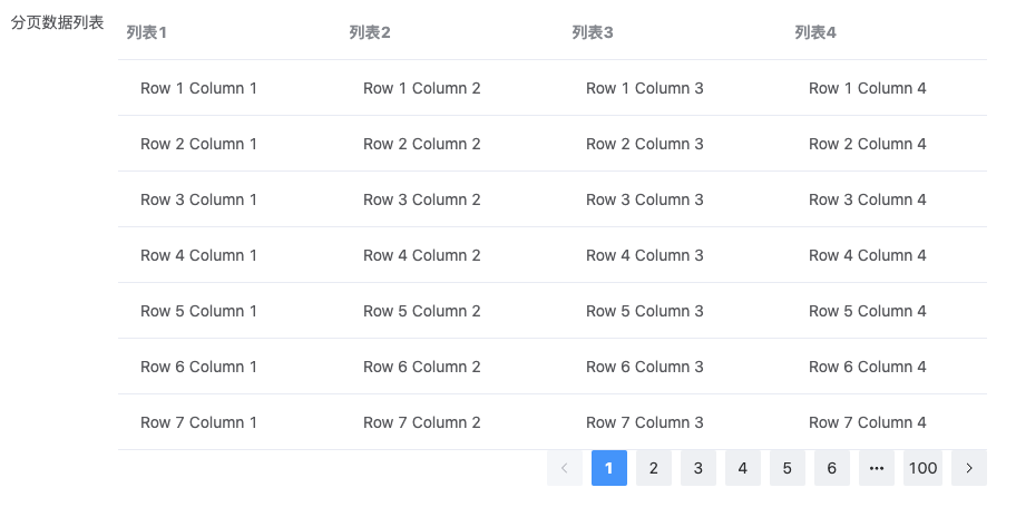
</script>View the effect

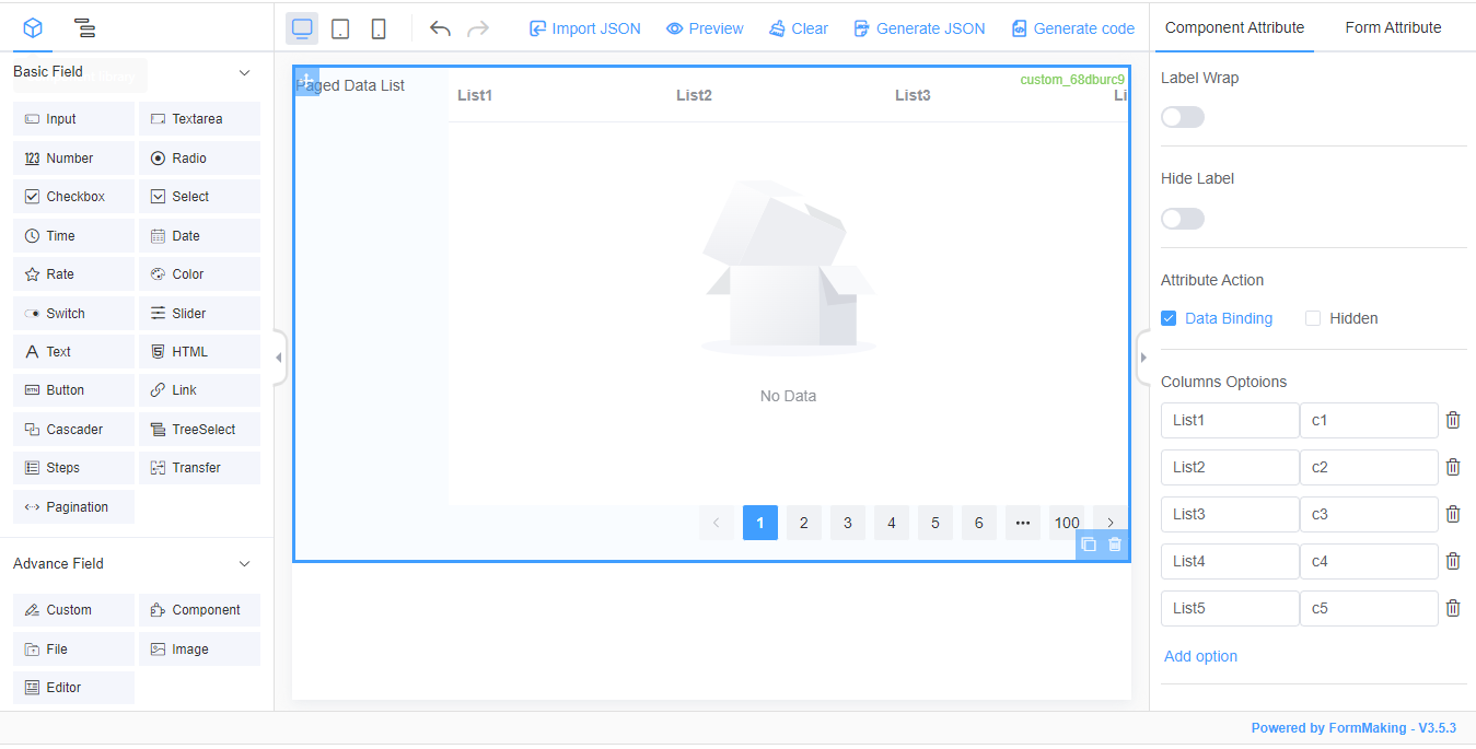
Configuration Component Table
Table Column Configuration
In the Field Properties panel, set the Extended Properties Configuration.
Extended property configuration
{
	"columns": [
		{
			"title": "list1",
			"dataKey": "c1",
			"width": 200
		},
		{
			"title": "list2",
			"dataKey": "c2",
			"width": 200
		},
		{
			"title": "list3",
			"dataKey": "c3",
			"width": 200
		},
		{
			"title": "list4",
			"dataKey": "c4",
			"width": 200
		}
	]
}
Table Column Configuration (Visual)^1.4.5
In addition to the above configuration list via JSON, we provide another way to configure columns via custom properties.
Template configuration
<script setup>
const customFields = reactive([
  {
    name: 'Paging data list',
    el: 'custom-pagination-table',
    options: {
      ...
      extendProps: {
        columns: [] // Used to configure the columns of the table
      },
      customProps: {
        columns: customColumns
      }
    }
  }
])

const handleAddColumn = (columns) => {
  let len = columns.length
  columns.push({
    "title": "list" + (len + 1),
    "dataKey": "c" + (len + 1),
    "width": 200
  })
}
const handleRemoveColumn = (columns, index) => {
  columns.splice(index, 1)
}
</script>

<template>
  <fm-making-form
    ...
  >
    <template #widgetconfig="{data, customProps}">
      <el-form-item v-if="data.el == 'custom-pagination-table'" :label="t('columns')">
          <div :key="index" v-for="(item, index) in customProps.columns" style="display: flex; margin-bottom: 10px;">
              <el-input placeholder="Title" clearable  v-model="item.title"></el-input>
              <el-input placeholder="DataKey" clearable  v-model="item.dataKey"></el-input>
              <i @click="handleRemoveColumn(customProps.columns,index)" style="font-size: 16px;margin: 0 5px;cursor: pointer;"><i class="iconfont icon-delete"></i></i>
          </div>
        <el-button link type="primary" @click="handleAddColumn(customProps.columns)">{{$t('fm.actions.addOption')}}</el-button>
      </el-form-item>
    </template>
  </fm-making-form>
</template>
View the effect
Load Data
The on-load event of data loading was thrown to the designer by emit from the custom component for configuration. In the Field Property Panel-Action Settings, we added the following configuration of the onLoad event:
function () {
  // $eventArgs The variable stores the emit event's arguments
    const { $eventArgs } = arguments[0]

  const currentPage = $eventArgs[0]

  let listdata = Array.from({length: 10}).map((_, index) => {
    let row = (currentPage - 1) * 10 + (index + 1)

    return {
      c1: `Row ${row} Column 1`,
      c2: `Row ${row} Column 2`,
      c3: `Row ${row} Column 3`,
      c4: `Row ${row} Column 4`
    }
  })

  this.setData({
    list: listdata
  })
}
View the effect