Custom Field
You can configure to import your own components in the designer Field panel.
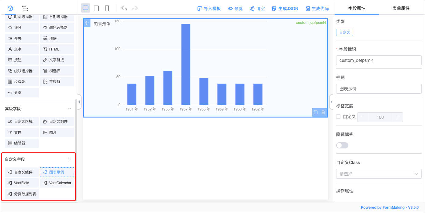
Next we'll detail how to add a custom field to the designer:
Implement Custom Components
Let's simply implement a custom component:
CustomWidthHeight.vue
<template>
  <div class="custom-component">
    <span>
     Width:<el-input v-model="dataModel.width" style="width: 200px;"></el-input>
    </span>
    <span>
      Height:<el-input v-model="dataModel.height" style="width: 200px;"></el-input>
    </span>
  </div>
</template>

<script>
export default {
  name: 'custom-width-height',
  props: {
    value: {
      type: Object,
      default: () => ({})
    }
  },
  data() {
    return {
      dataModel: this.value
    }
  },
  watch: {
    value (val) {
      this.dataModel = val
    },
    dataModel (val) {
      this.$emit('input', val)
    }
  }
}
</script>

<style lang="scss">
.custom-component{
  padding: 10px;

  span{
    +span{
      margin-left: 10px;
    }
  }
}
</style>
TIP
Note that the custom component must be able to support the v-model for bidirectional binding.
Register the Component
Vue.use(FormMaking, {
  components: [{
    name: 'custom-width-height',
    component: CustomWidthHeight // custom component
  }]
})
You can also use Vue.component to register components.
Configuration of Designer
<template>
  <fm-making-form
    :custom-fields="customFields"
  >
  </fm-making-form>
</template>

<script>
export default {
  data() {
    return {
      customFields: [
        {
          name: 'Custom component', // Filed name
          el: 'custom-width-height', // The name of the component registration
          options: {
            /*The following are the field properties that come with the designer and can be configured according to the properties of your own components */
            defaultValue: {}, // default
            customClass: '', // Custom style
            labelWidth: 100, // Width of label
            isLabelWidth: false, // Whether to display the label
            hidden: false, // Hide  property
            dataBind: true, // Data binding property
            required: false, // Required property
            dataType: '', // Data type verification
            pattern: '', // Regular expression verification
            validator: '', // Custom validation
          }
        }
      ]
    }
  }
}
</script>
Field Property Configuration
The property configuration of custom fields is divided into Build-in Property, Incoming Property, Extended Property and Custom Property. Let's explain it in detail below:
Build-in Property
options: {
    defaultValue: {}, // default
    customClass: '', // Custom style
    labelWidth: 100, // Width of label
    isLabelWidth: false, // Whether to display the label
    hidden: false, // Hide  property
    dataBind: true, // Data binding property
    required: false, // Required property
    dataType: '', // Data type verification
    pattern: '', // Regular expression verification
    validator: '', // Custom validation
}
These properties do not need to be handled within the component itself, only the corresponding parameters need to be added during designer configuration.
Incoming Property
options: {
  width: 100, // width
  height: 100, // height
  placeholder: '', // height
  readonly: false, // readonly
  disabled: false, // disabled
  editable: false, // editable
  clearable: false, // clearable
   printRead: false, // reading model
}
These properties can be set directly in the designer configuration, but you need your own components to support these properties, passed in via props.
View Sample
Let's make some improvements to the custom-width-height component to see how it can be configured:
<template>
  <div class="custom-component" :style="{
    width,
    height
  }">
    <span>
      Width:<el-input v-model="dataModel.width" :disabled="disabled" style="width: 200px;"></el-input>
    </span>
    <span>
      Height:<el-input v-model="dataModel.height" :disabled="disabled" style="width: 200px;"></el-input>
    </span>
  </div>
</template>props: {
value: {
type: Object,
default: () => ({})
},
width: {
type: String,
default: ''
},
height: {
type: String,
default: ''
},
disabled: {
type: Boolean,
default: false
}
}We added width height disabled three props for the custom component 'custom-width-height, and used them inside the component. Then we only need to introduce them in the designer, as follows:
<template>
  <fm-making-form
    :custom-fields="customFields"
  >
  </fm-making-form>
</template>

<script>
export default {
  data() {
    return {
      customFields: [
        {
          name: 'custom component',
          el: 'custom-width-height',
          options: {
            defaultValue: {},
            customClass: '',
            labelWidth: 0,
            isLabelWidth: false,
            hidden: false,
            dataBind: true,
            width: '',
            height: '',
            disabled: false
          }
        }
      ]
    }
  }
}
</script>
Extension Property
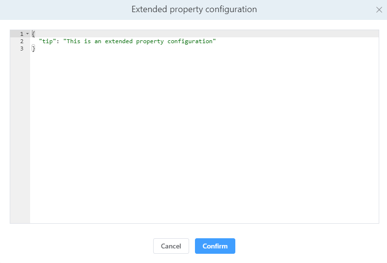
In addition to supporting the above two attributes, a custom component can be configured by extending the attributes according to the situation of the component.
options: {
  extendProps: {} // Extended properties, extended Props configuration for components
}
View Sample
We add a tip property to thecustom-width-height component, which is not in the Build-in and Incoming properties:
<template>
  <div class="custom-component" :style="{
    width,
    height
  }">
    <span>
      Width:<el-input v-model="dataModel.width" :disabled="disabled" style="width: 200px;"></el-input>
    </span>
    <span>
      Height:<el-input v-model="dataModel.height" :disabled="disabled" style="width: 200px;"></el-input>
    </span>
    <div>{{tip}}</div>
  </div>
</template>props: {
tip: {
type: String,
default: ''
}
}The configuration for adding extendProps in the designer is as follows:
<template>
  <fm-making-form
    :custom-fields="customFields"
  >
  </fm-making-form>
</template>

<script>
export default {
  data() {
    return {
      customFields: [
        {
          name: 'custom component',
          el: 'custom-width-height',
          options: {
            defaultValue: {},
            customClass: '',
            labelWidth: 0,
            isLabelWidth: false,
            hidden: false,
            dataBind: true,
            width: '',
            height: '',
            disabled: false,
            extendProps: {}
          }
        }
      ]
    }
  }
}
</script>
Configure it in the Field Property panel-Extended Property Configuration Setting box:
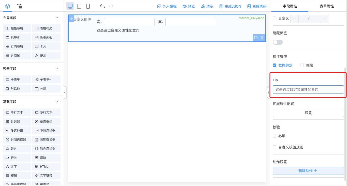
Custom Property
TIP
The function of custom property and extension property is similar. They both extend the configuration of components for fields. The difference is that the extension property needs to configure json data, while the custom property is more friendly to user configuration and can operate the configuration visually through the interface.
Add the customProps configuration to the designer:
<template>
  <fm-making-form
    :custom-fields="customFields"
    >
    <template #widgetconfig="{type, data, customProps}">
      <el-form-item v-if="type === 'custom' && data.el=== 'custom-width-height'" label="Tip">
        <el-input v-model="customProps.tip"></el-input>
      </el-form-item>
    </template>
  </fm-making-form>
</template>

<script>
  export default {
    data() {
      return {
        customFields: [
          {
            name: 'custom component',
            el: 'custom-width-height',
            options: {
              // ...
              customProps: {} // custom properties
            }
          }
        ]
      }
    }
  }
</script>
Through the Field Property panel Operable properties:
Field Event Configuration
Built-in Event
The form designer has built-in onChange events for custom fields, which can be configured directly in custom-fields.
<fm-making-form
:custom-fields="[
{
name: 'custom component',
el: 'custom-width-height',
options: {
// ...
},
events: {
onChange: '' // You can configure the event name here
}
}
]"
>
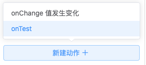
</fm-making-form>Non built-in events
In addition to the built-in form events, all events can be passed to the designer via $emit, and then the event name can be configured in the custom-fields.
// CustomWidthHeight.vue
this.$emit('on-test') <fm-making-form
:custom-fields="[
{
name: 'custom component',
el: 'custom-width-height',
options: {
// ...
},
events: {
'on-test': '' // You can configure the event name here
}
}
]"
>
</fm-making-form>View the effect
Custom Icon
You can configure the following to add custom ICONS for custom fields.
<fm-making-form
  :custom-fields="[
    {
      name: '自定义组件',
      el: 'custom-width-height',
      icon: '<svg fill="none" stroke="currentColor" stroke-width="1.5" viewBox="0 0 24 24" xmlns="http://www.w3.org/2000/svg" aria-hidden="true"><path stroke-linecap="round" stroke-linejoin="round" d="M13.5 16.875h3.375m0 0h3.375m-3.375 0V13.5m0 3.375v3.375M6 10.5h2.25a2.25 2.25 0 002.25-2.25V6a2.25 2.25 0 00-2.25-2.25H6A2.25 2.25 0 003.75 6v2.25A2.25 2.25 0 006 10.5zm0 9.75h2.25A2.25 2.25 0 0010.5 18v-2.25a2.25 2.25 0 00-2.25-2.25H6a2.25 2.25 0 00-2.25 2.25V18A2.25 2.25 0 006 20.25zm9.75-9.75H18a2.25 2.25 0 002.25-2.25V6A2.25 2.25 0 0018 3.75h-2.25A2.25 2.25 0 0013.5 6v2.25a2.25 2.25 0 002.25 2.25z"></path></svg>',
      options: {
        // ...
      },
    }
  ]"
>
</fm-making-form>
Instead of using Svg, you can also use the <img> tag directly:
icon: '<img src="..." />'