
自定义字段
可以在设计器字段面板中配置引入自己的组件进行操作。
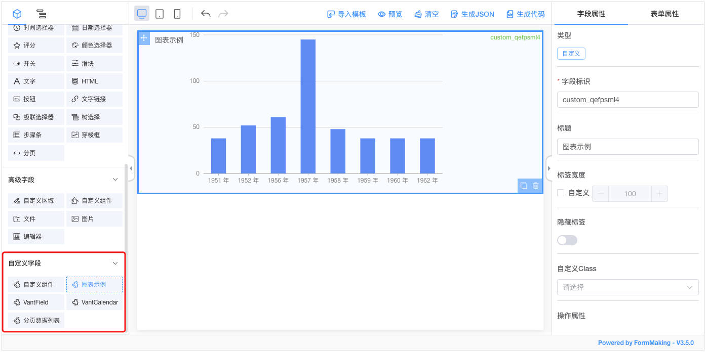
接下来我们将详细讲述下如何添加一个自定义字段到设计器中:
实现自定义组件
我们简单实现一个自定义组件:
CustomWidthHeight.vue
<template>
  <div class="custom-component">
    <span>
      宽:<el-input v-model="dataModel.width" style="width: 200px;"></el-input>
    </span>
    <span>
      高:<el-input v-model="dataModel.height" style="width: 200px;"></el-input>
    </span>
  </div>
</template>

<script>
export default {
  name: 'custom-width-height',
  props: {
    value: {
      type: Object,
      default: () => ({})
    }
  },
  data() {
    return {
      dataModel: this.value
    }
  },
  watch: {
    value (val) {
      this.dataModel = val
    },
    dataModel (val) {
      this.$emit('input', val)
    }
  }
}
</script>

<style lang="scss">
.custom-component{
  padding: 10px;

  span{
    +span{
      margin-left: 10px;
    }
  }
}
</style>
TIP
需要注意,自定义组件必须能够支持 v-model 进行双向绑定。
注册组件
Vue.use(FormMaking, {
  components: [{
    name: 'custom-width-height',
    component: CustomWidthHeight // 自定义组件
  }]
})
也可以使用 Vue.component 进行组件的注册。
设计器配置
<template>
  <fm-making-form
    :custom-fields="customFields"
  >
  </fm-making-form>
</template>

<script>
export default {
  data() {
    return {
      customFields: [
        {
          name: '自定义组件', // 字段名称
          el: 'custom-width-height', // 组件注册的名称
          options: {
            /* 下面是设计器中自带的字段属性,可以根据自己组件的属性来进行配置 */
            defaultValue: {}, // 默认值
            customClass: '', // 自定义样式
            labelWidth: 100, // 标签宽度
            isLabelWidth: false, // 是否展示标签
            hidden: false, // 隐藏属性
            dataBind: true, // 数据绑定属性
            required: false, // 必填校验
            dataType: '', // 数据类型校验
            pattern: '', // 正则表达式校验
            validator: '', // 自定义校验
          }
        }
      ]
    }
  }
}
</script>
字段属性配置
自定义字段的属性配置分成了 自带属性 、传入属性、扩展属性 和 自定义属性,下面来详细说明下:
自带属性
options: {
  defaultValue: '', // 默认值
  customClass: '', // 自定义样式
  labelWidth: 100, // 标签宽度
  isLabelWidth: false, // 是否展示标签
  hidden: false, // 隐藏属性
  dataBind: true, // 数据绑定属性
  required: false, // 必填校验
  dataType: '', // 数据类型校验
  pattern: '', // 正则表达式校验
  validator: '', // 自定义校验
}
这些属性不需要自己在组件内部处理,只需要在设计器配置的时候添加对应的参数即可。
传入属性
options: {
  width: 100, // 宽度
  height: 100, // 高度
  placeholder: '', // 占位符
  readonly: false, // 只读
  disabled: false, // 禁用
  editable: false, // 可编辑
  clearable: false, // 可清除
  printRead: false, // 阅读模式
}
这些属性可以直接在设计器配置的时候进行设定,但是需要你自己的组件支持这些属性,通过 props 传入。
查看示例
我们来对 custom-width-height 组件进行一些改进,来具体看下如何配置:
<template>
  <div class="custom-component" :style="{
    width,
    height
  }">
    <span>
      宽:<el-input v-model="dataModel.width" :disabled="disabled" style="width: 200px;"></el-input>
    </span>
    <span>
      高:<el-input v-model="dataModel.height" :disabled="disabled" style="width: 200px;"></el-input>
    </span>
  </div>
</template>props: {
value: {
type: Object,
default: () => ({})
},
width: {
type: String,
default: ''
},
height: {
type: String,
default: ''
},
disabled: {
type: Boolean,
default: false
}
}我们为自定义的组件 custom-width-height 添加了width height disabled三个 prop,并且在组件内部进行了使用,接下来只需要在设计器中引入即可,如下:
<template>
<fm-making-form
:custom-fields="customFields"
>
</fm-making-form>
</template>
<script>
export default {
data() {
return {
customFields: [
{
name: '自定义组件',
el: 'custom-width-height',
options: {
defaultValue: {},
customClass: '',
labelWidth: 0,
isLabelWidth: false,
hidden: false,
dataBind: true,
width: '',
height: '',
disabled: false
}
}
]
}
}
}
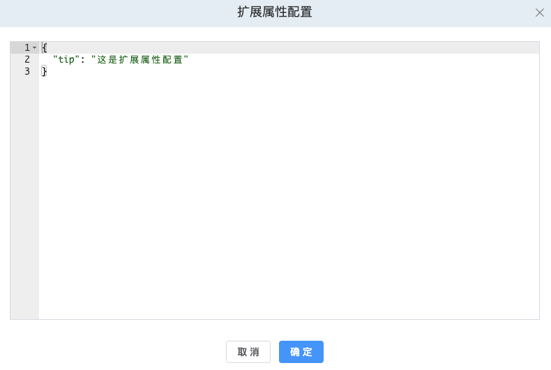
</script>扩展属性
自定义的组件除了支持以上两种属性外,另外可以根据组件的情况扩展属性进行配置。
options: {
  extendProps: {} // 扩展属性,组件的扩展Props配置
}
查看示例
我们为 custom-width-height 组件添加一个 tip的属性,该属性不在自带和传入属性中:
<template>
  <div class="custom-component" :style="{
    width,
    height
  }">
    <span>
      宽:<el-input v-model="dataModel.width" :disabled="disabled" style="width: 200px;"></el-input>
    </span>
    <span>
      高:<el-input v-model="dataModel.height" :disabled="disabled" style="width: 200px;"></el-input>
    </span>
    <div>{{tip}}</div>
  </div>
</template>props: {
tip: {
type: String,
default: ''
}
}在设计器中添加 extendProps的配置如下:
<template>
  <fm-making-form
    :custom-fields="customFields"
  >
  </fm-making-form>
</template>

<script>
export default {
  data() {
    return {
      customFields: [
        {
          name: '自定义组件',
          el: 'custom-width-height',
          options: {
            defaultValue: {},
            customClass: '',
            labelWidth: 0,
            isLabelWidth: false,
            hidden: false,
            dataBind: true,
            width: '',
            height: '',
            disabled: false,
            extendProps: {}
          }
        }
      ]
    }
  }
}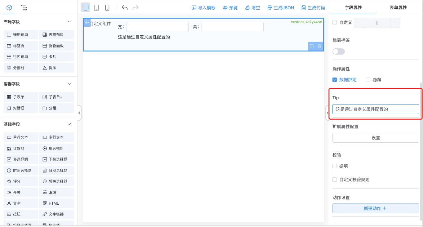
</script>在字段属性面板-扩展属性配置设置框中进行配置:
自定义属性
TIP
自定义属性和扩展属性功能类似,都是为字段扩展组件的配置,不同之处在于,扩展属性需要配置json数据,而自定义属性对用户配置更加友好,通过界面可视化操作配置。
在设计器中添加 customProps 配置:
<template>
  <fm-making-form
    :custom-fields="customFields"
    >
    <template #widgetconfig="{type, data, customProps}">
      <el-form-item v-if="type === 'custom' && data.el=== 'custom-width-height'" label="Tip">
        <el-input v-model="customProps.tip"></el-input>
      </el-form-item>
    </template>
  </fm-making-form>
</template>

<script>
  export default {
    data() {
      return {
        customFields: [
          {
            name: '自定义组件',
            el: 'custom-width-height',
            options: {
              // ...
              customProps: {} // 自定义字段属性
            }
          }
        ]
      }
    }
  }
</script>通过字段属性面板可操作属性:
字段事件配置
内置事件
表单设计器为自定义字段内置了 onChange事件,直接在 custom-fields 中配置即可。
<fm-making-form
:custom-fields="[
{
name: '自定义组件',
el: 'custom-width-height',
options: {
// ...
},
events: {
onChange: '' // 在此处配置事件名称即可
}
}
]"
>
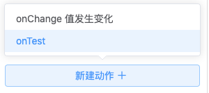
</fm-making-form>非内置事件
除了内置的表单事件外,其他的事件皆可以通过 $emit 传递给设计器,然后在custom-fields配置事件名称即可。
// CustomWidthHeight.vue
this.$emit('on-test') <fm-making-form
:custom-fields="[
{
name: '自定义组件',
el: 'custom-width-height',
options: {
// ...
},
events: {
'on-test': '' // 在此处配置事件名称即可
}
}
]"
>
</fm-making-form>查看效果
自定义图标
可以通过如下配置来为自定义字段添加自定义的图标。
<fm-making-form
  :custom-fields="[
    {
      name: '自定义组件',
      el: 'custom-width-height',
      icon: '<svg fill="none" stroke="currentColor" stroke-width="1.5" viewBox="0 0 24 24" xmlns="http://www.w3.org/2000/svg" aria-hidden="true"><path stroke-linecap="round" stroke-linejoin="round" d="M13.5 16.875h3.375m0 0h3.375m-3.375 0V13.5m0 3.375v3.375M6 10.5h2.25a2.25 2.25 0 002.25-2.25V6a2.25 2.25 0 00-2.25-2.25H6A2.25 2.25 0 003.75 6v2.25A2.25 2.25 0 006 10.5zm0 9.75h2.25A2.25 2.25 0 0010.5 18v-2.25a2.25 2.25 0 00-2.25-2.25H6a2.25 2.25 0 00-2.25 2.25V18A2.25 2.25 0 006 20.25zm9.75-9.75H18a2.25 2.25 0 002.25-2.25V6A2.25 2.25 0 0018 3.75h-2.25A2.25 2.25 0 0013.5 6v2.25a2.25 2.25 0 002.25 2.25z"></path></svg>',
      options: {
        // ...
      },
    }
  ]"
>
</fm-making-form>除了使用Svg,还可以直接使用<img>标签:
icon: '<img src="..." />'